Kas Tutorials
These tutorials concern the Kas GUI system. See also the Kas examples and 7GUIs examples.
Further reading can be found on the Kas blog.
Please ask questions on the discussion boards or on the tutorials issue tracker.
Requirements
It is assumed that you are already familiar with the Rust language. If not, then Learn Rust! You are not expected to master Rust before learning Kas, but this tutorial series assumes a moderate understanding of the language.
Kas supports stable Rust, however better proc-macro diagnostics (including warnings) are available when using nightly Rust with Kas's nightly-diagnostics feature.
Tutorials use the latest stable release of Kas, currently v0.17.
Examples
All significant examples can be found as working apps in the example directory.
To run the examples locally, check out the tutorials repository, then run e.g.:
git clone https://github.com/kas-gui/tutorials.git
cd tutorials
cargo run --example counter
Logging
Kas uses the log facade internally. To enable output, we need an implementation, such as env_logger. Add this to fn main():
#![allow(unused)]
fn main() {
env_logger::init();
}
Trace level can be a bit chatty; to get a reasonable level of output you might try this:
export RUST_LOG=warn,naga=error,kas=debug
cargo run --example counter
Kas Dependencies
What is kas? Here is a heavily-reduced dependency tree:
kas — Wrapper crate to expose all components under a single API
├── kas-core — Core types, traits and event handling
│   ├── accesskit — UI accessibility infrastructure
│   ├── arboard — Clipboard support (optional)
│   ├── async-global-executor — Executor supporting EventState::push_spawn (optional)
│   ├── easy-cast — Numeric type-casting, re-exposed as kas::cast
│   ├── image — Imaging library for common image formats
│   ├── kas-macros (proc-macro) — Macros
│   │   └── impl-tools-lib — Backend used to implement macros
│   ├── kas-text — Font handling, type setting
│   │   ├── fontique — Font enumeration and fallback
│   │   ├── swash — Font introspection and glyph rendering
│   │   ├── pulldown-cmark — Markdown parsing (optional)
│   │   ├── rustybuzz — Shaping (optional, default)
│   │   ├── ttf-parser — Font parser for TrueType, OpenType and AAT
│   │   └── unicode-bidi — Unicode Bidirectional Algorithm
│   ├── log — Logging facade
│   ├── serde — Serialization support for persistent configuration (optional)
│   ├── serde_json, serde_yaml, ron — Output formats for configuration (optional)
│   ├── smithay-clipboard — Wayland clipboard support (optional)
│   └── winit — Cross-platform window creation
│   │   └── raw-window-handle — Interoperability for Rust Windowing applications
├── kas-widgets — Standard widget collection
├── kas-resvg — Canvas and Svg widgets
│   ├── resvg — An SVG rendering library
│   └── tiny-skia — Tiny CPU-only Skia subset
├── kas-view — "View widgets" over data models (optional)
└── kas-wgpu — Kas graphics backend over WGPU
    └── wgpu — Rusty WebGPU API wrapper
Licence
This tutorial, including text but excluding code samples, is licensed under CC BY-SA 4.0
Code samples found within this tutorial are marked with CC0 1.0
Hello World!
Topics: logging, app, run
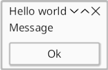
Lets get started with a simple message box. Source.
use kas::widgets::{Button, column};
use kas::window::Window;

fn main() -> kas::runner::Result<()> {
    let ui = column![
        "Hello, world!",
        Button::label("&Close").with(|cx, _| cx.exit())
    ];
    let window = Window::new(ui, "Hello").escapable();

    kas::runner::Runner::new(())?.with(window).run()
}
cargo run --example hello
The UI
We use the column! macro to construct our layout. This macro turns string literals into label widgets for us, ensuring that "Hello, world!" will appear on the screen.
For the button, we use a Button widget. The button's action handler calls EventState::exit to terminate the UI. (To close the window without terminating the UI, we would instead call cx.window_action(Action::CLOSE);.)
The Window
We construct a Window over the ui and a title. We also call Window::escapable to allow our window to be closed using the Escape key.
The Runner
Every UI needs a Runner. In this example we simply construct a runner over data (), add a single window, and run. In later examples you will see how we can select a theme, use input data, multiple windows and tweak the configuration.
Finally, Runner::run starts our UI. This method runs the event-loop internally, returning Ok(()) once all windows have closed successfully.
Counter: an interactive widget
Topics: layout, input data, messages
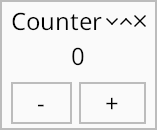
The last example was a bit boring. Lets get interactive!
use kas::prelude::*;
use kas::widgets::{Button, column, format_label, row};

#[derive(Clone, Debug)]
struct Increment(i32);

fn counter() -> impl Widget<Data = ()> {
    let tree = column![
        format_label!("{}").align(AlignHints::CENTER),
        row![
            Button::label_msg("−", Increment(-1)),
            Button::label_msg("+", Increment(1)),
        ]
        .map_any(),
    ];

    tree.with_state(0)
        .on_message(|_, count, Increment(add)| *count += add)
}

fn main() -> kas::runner::Result<()> {
    env_logger::init();

    let theme = kas::theme::SimpleTheme::new();
    let mut app = kas::runner::Runner::with_theme(theme).build(())?;
    let _ = app.config_mut().font.set_size(24.0);
    let window = Window::new(counter(), "Counter").escapable();
    app.with(window).run()
}
Preamble
Prelude
The kas::prelude includes a bunch of commonly-used, faily unambiguous stuff:
#![allow(unused)]
fn main() {
use kas::prelude::*;
}
Impl trait
If you're new to Rust, you might find the following confusing:
#![allow(unused)]
fn main() {
use kas::prelude::*;
fn counter() -> impl Widget<Data = ()> {
    // ...
    kas::widgets::Label::new("")
}
}
This is (return position) impl trait, specifying that the Widget trait's associated type Data is ().
(We'll get back to this type Data in a bit.)
Widgets
What is a widget? Simply a type implementing the Widget trait (or, depending on the context, an instance of such a type).
Widgets must implement the super-traits Layout and Tile, both of which are object-safe (use Tile::as_tile to get a &dyn Tile). Widget is also object-safe, but only where its associated Widget::Data type is specified (see Input Data below).
In this example we'll only use library widgets and macro-synthesized widgets; custom widgets will be covered later.
Layout macros
Our user interface should be a widget tree: lets use a row! of buttons and a column! layout for the top-level UI tree:
#![allow(unused)]
fn main() {
use kas::prelude::*;
use kas::widgets::{Adapt, AdaptWidget, Button, column, format_label, row};
#[derive(Clone, Debug)]
struct Increment(i32);
fn counter() -> impl Widget<Data = ()> {
    let tree = column![
        format_label!("{}").align(AlignHints::CENTER),
        row![
            Button::label_msg("−", Increment(-1)),
            Button::label_msg("+", Increment(1)),
        ]
        .map_any(),
    ];
    tree.with_state(0)
}
}
row! and column! are deceptively simple macros which construct a column or row over other widgets. I say deceptively simple because a fair amount of these macro's functionality is hidden, such as constructing a label widget from a string literal and emulating the .align(..) and .map_any() (see Input Data) method calls we see here. Still, you should be able to ignore this complexity.
Input Data
The Widget::Data type mentioned above is used to provide all Kas widgets with input data. This is passed into Events::update (called whenever the data may have changed) and to a number of event-handling methods.
Why? Most UIs need some form of mutable state. Some modern UI toolkits like Iced and Xilem reconstruct their view tree (over a hidden widget tree) when this state changes; egui goes even further and reconstructs the whole widget tree. Older stateful toolkits like GTK and Qt require binding widget properties or explicitly updating widgets. Kas finds a compromise between these models: widgets are stateful, yet derived from a common object and updated as required.
In our case, format_label! constructs a Text widget which formats its input data (an i32) to a String and displays that.
Since it would be inconvenient to require an entire UI tree to use the same input data, Kas provides some tools to map that data (or in Xilem/Druid terminology, view that data through a lens):
AdaptWidget::maptakes a closure which can, for example, map a struct-reference to a struct-field-reference. (In fact this is effectively all it can do due to lifetime restrictions; anything more complex requires usingAdaptor similar.)AdaptWidgetAny::map_anysimply discards its input, passing&()to its child.Adaptstores a mutable value in the UI tree, passing this value to its child.- Custom widgets may store state in the UI tree and pass arbitrary references to children.
Providing input data: Adapt
In this case, we'll use () as our top-level data and an Adapt node for the mutable state (the count). The next chapter will use top-level data instead.
The code:
#![allow(unused)]
fn main() {
use kas::prelude::*;
use kas::widgets::{format_label, Adapt};
#[derive(Clone, Debug)]
struct Increment(i32);
fn counter() -> impl Widget<Data = ()> {
let tree = format_label!("{}");
    tree.with_state(0)
}
}
calls AdaptWidget::with_state to construct an Adapt widget over 0 (with type i32).
A reference to this (i.e. &i32) is passed into our display widget (format_label!("{}")). Meanwhile,
we used buttons.map_any() to ignore this value and pass &() to the Button widgets.
Messages
While input data gets state into widgets, messages let us get, well, messages out of widgets.
Any widget in the UI tree may post a message. While sometimes such messages have an intended recipient, often they are simply pushed to a message stack. Any widget above the source in the UI tree may handle messages (of known type).
In practice, message handling has three steps:
- Define a message type, in this case
Increment. The only requirement of this type is that it supportsDebug. (While we could in this case just usei32, using a custom type improves type safety and provides a better message in the log should any message go unhandled.) - A widget (e.g. our buttons) pushes a message to the stack using
EventCx::push. Many widgets provide convenience methods to do this, for exampleButton::label_msg. - Some widget above the sender in the UI tree retrieves the message using
EventCx::try_popand handles it somehow.Adapt::on_messageprovides a convenient way to write such a handler.
#![allow(unused)]
fn main() {
use kas::prelude::*;
use kas::widgets::{format_label, Adapt};
#[derive(Clone, Debug)]
struct Increment(i32);
fn counter() -> impl Widget<Data = ()> {
let tree = format_label!("{}");
    tree.with_state(0)
        .on_message(|_, count, Increment(add)| *count += add)
}
}
Aside: feel free to write your message emitters first and handlers later. If you miss a handler you will see a message like this in your log:
[2025-09-10T14:38:06Z WARN kas_core::erased] unhandled: Erased(Increment(1))
While the custom message types like Increment will not save you from forgetting to handle something, they will at least yield a comprehensible message in your log and prevent something else from handling the wrong message.
Should multiple messages use enum variants or discrete struct types? Either option works fine. Consider perhaps where the messages will be handled.
Sync-counter: data models
Topics: top-level AppData, multiple windows
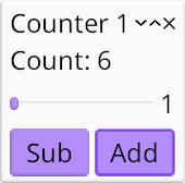
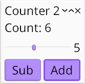
We complicate the previous example just a little bit!
use kas::widgets::{AdaptWidget, Button, Label, Slider, column, format_label, row};
use kas::window::Window;

#[derive(Clone, Debug)]
struct Increment(i32);

#[derive(Clone, Copy, Debug)]
struct Count(i32);
impl kas::runner::AppData for Count {
    fn handle_message(&mut self, messages: &mut impl kas::runner::ReadMessage) {
        if let Some(Increment(add)) = messages.try_pop() {
            self.0 += add;
        }
    }
}

fn counter(title: &str) -> Window<Count> {
    // Per window state: (count, increment).
    type Data = (Count, i32);
    let initial: Data = (Count(0), 1);

    #[derive(Clone, Debug)]
    struct SetValue(i32);

    let slider = Slider::right(1..=10, |_, data: &Data| data.1).with_msg(SetValue);
    let ui = column![
        format_label!(data: &Data, "Count: {}", data.0.0),
        row![slider, format_label!(data: &Data, "{}", data.1)],
        row![
            Button::new(Label::new_any("Sub")).with(|cx, data: &Data| cx.push(Increment(-data.1))),
            Button::new(Label::new_any("Add")).with(|cx, data: &Data| cx.push(Increment(data.1))),
        ],
    ];

    let ui = ui
        .with_state(initial)
        .on_update(|_, _, state, count| state.0 = *count)
        .on_message(|_, state, SetValue(v)| state.1 = v);
    Window::new(ui, title).escapable()
}

fn main() -> kas::runner::Result<()> {
    env_logger::init();

    let count = Count(0);
    let theme = kas_wgpu::ShadedTheme::new();

    let mut runner = kas::runner::Runner::with_theme(theme).build(count)?;
    let _ = runner.config_mut().font.set_size(24.0);
    runner
        .with(counter("Counter 1"))
        .with(counter("Counter 2"))
        .run()
}
AppData
In the previous example, our top-level AppData was () and our mutable state was stored in an Adapt widget. This time, we will store our counter in top-level AppData, in a custom type which includes a message handler:
#![allow(unused)]
fn main() {
#[derive(Clone, Debug)]
struct Increment(i32);

#[derive(Clone, Copy, Debug)]
struct Count(i32);

impl kas::runner::AppData for Count {
    fn handle_message(&mut self, messages: &mut impl kas::runner::ReadMessage) {
        if let Some(Increment(add)) = messages.try_pop() {
            self.0 += add;
        }
    }
}
}
AppData::handle_message is more verbose than Adapt::on_message, but does the same job.
To integrate this into our example, we pass a Count object into kas::runner::Builder::build and adjust the prototype of counter to:
#![allow(unused)]
fn main() {
#[derive(Clone, Copy, Debug)]
struct Count(i32);
impl kas::runner::AppData for Count {
    fn handle_message(&mut self, messages: &mut impl kas::runner::ReadMessage) {}
}
fn counter() -> impl kas::Widget<Data = Count> {
    // ...
    kas::widgets::Label::new_any("")
}
}
Adapting app data
We could at this point simply repeat the previous example, skipping the Adapt node since our AppData implementation already does the work. But lets make things more interesting by combining top-level state with local state.
We define a new data type for local state and construct an initial instance:
#![allow(unused)]
fn main() {
#[derive(Clone, Copy, Debug)]
struct Count(i32);
// Per window state: (count, increment).
type Data = (Count, i32);
let initial: Data = (Count(0), 1);
}
Note that our local data includes a copy of the top-level data Count (along with an initial value, Count(0), which will be replaced before it is ever used).
We'll skip right over the widget declarations to the new Adapt node:
#![allow(unused)]
fn main() {
use kas::widgets::{Adapt, AdaptWidget, Label};
#[derive(Clone, Copy, Debug)]
struct Count(i32);
fn counter() -> impl kas::Widget<Data = Count> {
#[derive(Clone, Debug)]
struct SetValue(i32);
let ui = Label::new_any("");
let initial = (Count(0), 1);
    let ui = ui
        .with_state(initial)
        .on_update(|_, _, state, count| state.0 = *count)
        .on_message(|_, state, SetValue(v)| state.1 = v);
    ui
}
}
The notable addition here is Adapt::on_update, which takes a closure over the expected mutable reference to local state as well as input data count (i.e. the top-level data), allowing us to update local state with the latest top-level count.
Aside: you may wonder why we store count in Adapt's state at all. Why not simply pass (&Count, &i32) (count, increment) down to the local UI? The answer is that we can't, because of lifetimes. To be specific, the input data type is formalized as an associated type, Widget::Data, which must outlive instances of that type: that is any references embedded in an input data type must outlive the instances of the widgets they are passed to. Moreover, AppData requires lifetime 'static (more as a simplification than because we truely couldn't support non-static lifetimes here, though there really isn't much use for them).
Aside aside: could we not make Widget::Data into a Generic Associated Type (GAT) to support lifetimes shorter than that of the widget object? Well, yes, but traits with GATs are not (yet) object-safe. This is a problem because object-safe widget types are important (both for variadic layout — e.g. a TabStack where pages use different widget types — and more fundamentally, namely to make Node work). So maybe this will be possible eventually, dependent on future Rust development.
Running multiple windows
Constructing multiple windows under a UI runner is simple:
use kas::window::Window;
#[derive(Clone, Copy, Debug)]
struct Count(i32);
impl kas::runner::AppData for Count {
    fn handle_message(&mut self, messages: &mut impl kas::runner::ReadMessage) {}
}
fn counter(title: &str) -> Window<Count> {
    Window::new(kas::widgets::Label::new_any(""), title)
}
fn main() -> kas::runner::Result<()> {
    let count = Count(0);
    let theme = kas_wgpu::ShadedTheme::new();
    let mut runner = kas::runner::Runner::with_theme(theme).build(count)?;
    let _ = runner.config_mut().font.set_size(24.0);
    runner
        .with(counter("Counter 1"))
        .with(counter("Counter 2"))
        .run()
}
Each window has its own local state stored in its Adapt node (the increment) while sharing the top-level Count.
Configuration
Topics: themes and UI configuration
We won't build anything new this chapter. Instead, we'll take a moment to discuss configuration.
Themes
Kas supports theme abstraction: widgets, for the most part, don't precisely determine their sizes or handle the minutae of drawing.
Theming is abstracted and exposed to widgets through two interfaces:
Kas currently provides three theme implementations (along with one meta-implementation):
kas::theme::SimpleThemeprioritises simplicity without loss of functionality.kas::theme::FlatThemeextendsSimpleTheme, putting more effort into styling while using no complex drawing techniques (well, if one doesn't count fonts).kas_wgpu::ShadedThemeextendsFlatThemeusing shaded drawing for bevelled widget borders. The resulting styling is rather opinionated, bordering on a tech demo (it could further be adapted to e.g. use the mouse pointer as a light source instead of assuming a fixed light position, though it would quickly become apparent that the theme lacks true shadows).kas::theme::MultiThemesupports run-time switching between pre-loaded themes. It is used by the Gallery example.
Configuration
Previously we adjusted the font size before the UI was started:
use kas::prelude::*;
fn main() -> kas::runner::Result<()> {
    let theme = kas::theme::SimpleTheme::new();
    let mut app = kas::runner::Runner::with_theme(theme).build(())?;
    let _ = app.config_mut().font.set_size(24.0);
    Ok(())
}
Various aspects of fonts, themes, event handling and shortcuts may be adjusted here; see the Config struct. The above snippet adjusts the default configuration before the UI is started using Runner::config_mut. The returned Action is discarded (let _ =) since the UI has not yet been started.
Configuration may also be adjusted through config files if the Kas feature toml (or another serialization format) and the environment variable KAS_CONFIG is set (e.g. KAS_CONFIG="path/to/config.toml"). See ReadWriteFactory documentation.
Run-time configuration of a sub-set of configurable items is possible using the EventConfig widget or by sending EventConfigMsg. Code may read configuration through EventState::config and adjust it using WindowConfig::update_base, though this has some limitations; in particular fonts are not re-selected and new widget sizes are not fully realized without manual resizing of the window.
Calculator: make_widget and grid layout
Topics: grid layout, access keys
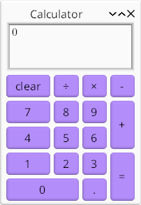
use std::num::ParseFloatError;
use std::str::FromStr;

use kas::event::NamedKey;
use kas::prelude::*;
use kas::theme::FrameStyle;
use kas::widgets::{AccessLabel, Adapt, Button, EditBox, Frame, column, grid};

type Key = kas::event::Key<kas::event::SmolStr>;

fn key_button(label: &str) -> Button<AccessLabel> {
    let string = AccessString::from(label);
    let key = string.key().unwrap().0.clone();
    Button::label_msg(string, key)
}
fn key_button_with(label: &str, key: Key) -> Button<AccessLabel> {
    Button::label_msg(label, key.clone()).with_access_key(key)
}

fn calc_ui() -> Window<()> {
    // We could use kas::widget::Text, but EditBox looks better.
    let display = EditBox::string(|calc: &Calculator| calc.display())
        .with_multi_line(true)
        .with_lines(3.0, 3.0)
        .with_width_em(5.0, 10.0)
        .with_margin_style(kas::theme::MarginStyle::None);

    let buttons = grid! {
        // Key bindings: C, Del
        (0, 0) => Button::label_msg("&clear", Key::Named(NamedKey::Clear))
            .with_access_key(NamedKey::Delete.into()),
        // Widget is hidden but has key binding.
        // TODO(opt): exclude from layout & drawing.
        (0, 0) => key_button_with("", NamedKey::Backspace.into()),
        (1, 0) => key_button_with("&÷", Key::Character("/".into())),
        (2, 0) => key_button_with("&×", Key::Character("*".into())),
        (3, 0) => key_button_with("&−", Key::Character("-".into())),
        (0, 1) => key_button("&7"),
        (1, 1) => key_button("&8"),
        (2, 1) => key_button("&9"),
        (3, 1..=2) => key_button("&+"),
        (0, 2) => key_button("&4"),
        (1, 2) => key_button("&5"),
        (2, 2) => key_button("&6"),
        (0, 3) => key_button("&1"),
        (1, 3) => key_button("&2"),
        (2, 3) => key_button("&3"),
        (3, 3..=4) => key_button_with("&=", NamedKey::Enter.into()),
        (0..=1, 4) => key_button("&0"),
        (2, 4) => key_button("&."),
    };
    // We use map_any to avoid passing input data (not wanted by buttons):
    let buttons = Frame::new(buttons).with_style(FrameStyle::None).map_any();

    let ui = Adapt::new(column![display, buttons], Calculator::new())
        .on_message(|_, calc, key| calc.handle(key));

    Window::new(ui, "Calculator")
        .escapable()
        .with_alt_bypass()
        .without_nav_focus()
}

fn main() -> kas::runner::Result<()> {
    env_logger::init();

    let theme = kas_wgpu::ShadedTheme::new();
    let mut app = kas::runner::Runner::with_theme(theme).build(())?;
    let _ = app.config_mut().font.set_size(24.0);
    app.with(calc_ui()).run()
}

#[derive(Clone, Debug)]
struct Calculator {
    // ...
}

impl Calculator {
    fn new() -> Calculator {
        Calculator {
            // ...
        }
    }

    fn display(&self) -> String {
        // ...
        String::new()
    }

    fn handle(&mut self, key: Key) {
        // ...
        let _ = key;
    }
}
The back-end: Calculator
First things first, lets define our backend, Calculator. It must have:
- Internal state (fields)
- A constructor (
new) - Some type of output. A
displayfunction returning aStringwill do. - A handler for button presses. We'll just pass a
Keytofn handle.
Fill out the implementation yourself or copy from the full source.
Access keys
To make the calculator keyboard-accessible, we'll use access keys (see more on Wikipedia or Windows app docs). Kas supports these via:
AccessStringsupports parsing things like&Fileas the labelFilewith access key FAccessLabelis a label widget over anAccessStringwhich sends the messageActivatewhen its access key is pressed. AButtonwidget will react to this message.Button::with_access_keymay be used to specify arbitrary access keys.
Button helper fns
To make constructing buttons easier, we define some helper functions. (These facilitate defining the button message more than they do the access keys.)
#![allow(unused)]
fn main() {
use kas::text::AccessString;
use kas::widgets::{AccessLabel, Button};
type Key = kas::event::Key<kas::event::SmolStr>;
fn key_button(label: &str) -> Button<AccessLabel> {
    let string = AccessString::from(label);
    let key = string.key().unwrap().clone();
    Button::label_msg(string, key)
}
fn key_button_with(label: &str, key: Key) -> Button<AccessLabel> {
    Button::label_msg(label, key.clone()).with_access_key(key)
}
}
Navigation focus and Alt-bypass
Normally, access keys are only active while holding Alt. To avoid this requirement we call with_alt_bypass. Further, we disable Tab key navigation with without_nav_focus and ensure that the window can be closed with the Esc key.
#![allow(unused)]
fn main() {
use kas::{Widget, widgets::{Label, Adapt}, window::Window};
#[derive(Debug)]
struct Calculator;
impl Calculator {
  fn new() -> Self { Calculator }
  fn handle(&mut self, _key: ()) {}
}
fn ui() -> impl Widget<Data = ()> {
let ui = Label::new_any("");
    Window::new(ui, "Calculator")
        .escapable()
        .with_alt_bypass()
        .without_nav_focus()
}
}
Grid layout
We already saw column and row layouts. This time, we'll use grid! for layout.
#![allow(unused)]
fn main() {
use kas::event::NamedKey;
use kas::prelude::*;
use kas::widgets::{AccessLabel, Button, Frame, grid};
use kas::theme::FrameStyle;
type Key = kas::event::Key<kas::event::SmolStr>;
fn key_button(label: &str) -> Button<AccessLabel> {
    let string = AccessString::from(label);
    let key = string.key().unwrap().clone();
    Button::label_msg(string, key)
}
fn key_button_with(label: &str, key: Key) -> Button<AccessLabel> {
    Button::label_msg(label, key.clone()).with_access_key(key)
}
fn ui() -> impl Widget<Data = i32> {
    let buttons = grid! {
        // Key bindings: C, Del
        (0, 0) => Button::label_msg("&clear", Key::Named(NamedKey::Clear))
            .with_access_key(NamedKey::Delete.into()),
        // Widget is hidden but has key binding.
        // TODO(opt): exclude from layout & drawing.
        (0, 0) => key_button_with("", NamedKey::Backspace.into()),
        (1, 0) => key_button_with("&÷", Key::Character("/".into())),
        (2, 0) => key_button_with("&×", Key::Character("*".into())),
        (3, 0) => key_button_with("&−", Key::Character("-".into())),
        (0, 1) => key_button("&7"),
        (1, 1) => key_button("&8"),
        (2, 1) => key_button("&9"),
        (3, 1..=2) => key_button("&+"),
        (0, 2) => key_button("&4"),
        (1, 2) => key_button("&5"),
        (2, 2) => key_button("&6"),
        (0, 3) => key_button("&1"),
        (1, 3) => key_button("&2"),
        (2, 3) => key_button("&3"),
        (3, 3..=4) => key_button_with("&=", NamedKey::Enter.into()),
        (0..=1, 4) => key_button("&0"),
        (2, 4) => key_button("&."),
    };
    // We use map_any to avoid passing input data (not wanted by buttons):
    let buttons = Frame::new(buttons).with_style(FrameStyle::None).map_any();
buttons
}
}
Worth noting is our hidden Backspace button. This is just another cell, but hidden under the clear button. Yes, this is a sub-optimal hack.
Again, we use .map_any() to make our buttons (input Data = ()) compatible with the parent UI element (input Data = Calculator).
Counter: a simple widget
Topics: custom widgets
Custom widgets are essentially the hard way to do things, but they do have their uses:
- Custom local state and event handlers are significantly more flexible than [
Adapt] - Custom
Layoutimplementations and custom mid-level graphics operations (e.g. the Clock example)
Here we rewrite the counter as a custom widget. There's no reason to do so for this particular case, but it serves as a simple example to the topic.
use kas::prelude::*;
use kas::widgets::{AccessLabel, Button, Row, Text, format_label};

#[derive(Clone, Debug)]
struct Increment(i32);

#[impl_self]
mod Counter {
    #[widget]
    #[layout(column![
        self.display.align(AlignHints::CENTER),
        self.buttons,
    ])]
    struct Counter {
        core: widget_core!(),
        #[widget(&self.count)]
        display: Text<i32, String>,
        #[widget]
        buttons: Row<[Button<AccessLabel>; 2]>,
        count: i32,
    }
    impl Self {
        fn new(count: i32) -> Self {
            Counter {
                core: Default::default(),
                display: format_label!("{}"),
                buttons: Row::new([
                    Button::label_msg("-", Increment(-1)),
                    Button::label_msg("+", Increment(1)),
                ]),
                count,
            }
        }
    }
    impl Events for Self {
        type Data = ();

        fn handle_messages(&mut self, cx: &mut EventCx, data: &()) {
            if let Some(Increment(incr)) = cx.try_pop() {
                self.count += incr;
                cx.update(self.as_node(data));
            }
        }
    }
}

fn main() -> kas::runner::Result<()> {
    env_logger::init();

    let window = Window::new(Counter::new(0), "Counter");

    let theme = kas::theme::SimpleTheme::new();
    let mut app = kas::runner::Runner::with_theme(theme).build(())?;
    let _ = app.config_mut().font.set_size(24.0);
    app.with(window).run()
}
Macros
impl_self
impl_self is an attribute macro from impl-tools. This macro wraps a type definition and impls on that type with a fake module of the same name. This fake module (here mod Counter) does not need to import (use) symbols from the parent module; in fact it may only contain one type definition with the same name as the fake module and impl items on this type.
Unfortunately, rust-analyzer does not fully support this: it may insert use statements inside the fake module. It may also mis-report errors against the entire fake module. One may instead use the impl_scope! macro, however since rustfmt refuses to format its contents this is the worse option. Perhaps some day this stuff will get fixed?
So, why do we have to wrap our widget implementations with a macro? Firstly, it supports impl Self syntax. Secondly (and much more importantly), it allows the #[widget] macro to operate on the type definition and various widget trait implementations simultaneously. This allows the macro to do useful things, like provide contextual default method implementations, inject debugging checks into provided method implementations, provide contextual warnings, and use a synthesized type to store extra state required by macro-generated layout code.
#[widget]
The #[widget] attribute-macro is used to implement the Widget trait. This is the only supported way to implement Widget.
    #[widget]
    struct Counter { /* .. */ }
Like it or not, the #[widget] macro is a fairly significant piece of what makes Kas work. Fortunately, most of the complexity is hidden such that you don't need to know about it and can refer to documentation on standard Rust traits.
To get the best diagnostics, be sure to use the nightly-diagnostics feature. (Hopefully Rust will stabilize custom proc-macro lints in the next year or so!)
Core data
All widgets must have a "core data" field. Typically this is named core; it must have type widget_core!() and can be initialized using Default.
core: widget_core!(),Child widgets
There are two types of child widgets: hidden layout-generated children and explicit children. The latter are fields with a #[widget] attribute:
        #[widget(&self.count)]
        display: Text<i32, String>,
        #[widget]
        buttons: Row<[Button<AccessLabel>; 2]>,
The first of these is a Text widget, passed &self.count as input data. The second is a Row widget over Buttons over AccessLabels. Since we didn't specify a data mapping for this second widget, it is is passed the Count widget's input data (()).
Omitting #[widget] on a field which is a child widget is an error; sometimes the outer #[widget] attribute-macro will report the issue but not always. For example, if we omit the attribute on buttons and run, we get a backtrace like the following:
thread 'main' (413532) panicked at /path/to/kas/crates/kas-core/src/core/data.rs:123:13:
WidgetStatus of #INVALID: require Configured, found New
stack backtrace:
   0: __rustc::rust_begin_unwind
             at /rustc/a1208bf765ba783ee4ebdc4c29ab0a0c215806ef/library/std/src/panicking.rs:698:5
   1: core::panicking::panic_fmt
             at /rustc/a1208bf765ba783ee4ebdc4c29ab0a0c215806ef/library/core/src/panicking.rs:75:14
   2: kas_core::core::data::WidgetStatus::require
             at /path/to/kas/crates/kas-core/src/core/data.rs:123:13
   3: kas_core::core::data::WidgetStatus::size_rules
             at /path/to/kas/crates/kas-core/src/core/data.rs:157:18
   4: <kas_widgets::list::List<C,D> as kas_core::core::layout::Layout>::size_rules
             at /path/to/kas/crates/kas-widgets/src/list.rs:207:1
   5: <custom_widget::Counter as kas_core::core::layout::MacroDefinedLayout>::size_rules::{{closure}}
             at ./examples/custom-widget.rs:7:1
  ...
  27: custom_widget::main
             at ./examples/custom-widget.rs:55:22
This tells us that some widget should have been Configured but had status New when calling size_rules — because we forgot to say that buttons is a #[widget] and thus needs to be configured. (This is in fact a debug-mode only check; release builds crash with a much-less-useful backtrace.)
Layout
All widgets must implement the Layout trait, but only a few do so directly. Most, instead, use the #[layout] attribute-macro.
    #[layout(column![
        self.display.align(AlignHints::CENTER),
        self.buttons,
    ])]
    struct Counter { /* .. */ }
In this case, we are not using the column! macro (which would not be able to reference self.display) but rather an emulation of it. Behaviour should be identical aside from this ability to reference struct fields and not needing to use kas::widgets::column.
Widget traits
Widget has super-trait Tile which has super-trait Layout. Futher, Events is usually implemented (unless there is no event-handling logic). Impls of any of these traits may appear in a widget implementation, but none are required.
It is however required to define the associated type Widget::Data. Since it is common to implement Events instead of Widget and trait Events: Widget, the #[widget] macro allows you to take the liberty of defining type Data on Events instead of Widget:
#![allow(unused)]
fn main() {
use kas::prelude::*;
#[derive(Clone, Debug)]
struct Increment(i32);
impl_scope! {
    #[widget]
    #[layout("")]
    struct Counter {
        core: widget_core!(),
        count: i32,
    }
    impl Events for Self {
        type Data = ();

        fn handle_messages(&mut self, cx: &mut EventCx, data: &()) {
            if let Some(Increment(incr)) = cx.try_pop() {
                self.count += incr;
                cx.update(self.as_node(data));
            }
        }
    }
}
}
In this case we implement one event-handling method, Events::handle_messages, to update self.count when an Increment message is received.
Updating state
When updating local state in a custom widget, it is requried to explicitly trigger an update to any widgets using that state as their input data. This can be done in a few ways:
cx.action(self, Action::UPDATE)will notify that an update toself(and children) is requiredcx.update(self.as_node(data))will updateself(and children) immediatelycx.update(self.display.as_node(&self.count))will updateself.displayimmediately
Note that previously:
- We used
Adapt::on_messageto update state: this automatically updates children - We used
AppData::handle_messages: again, this automatically updates children
Custom widgets are not the same in this regard.
Don't worry about remembering each step; macro diagnostics should point you in the right direction. Detection of fields which are child widgets is however imperfect (nor can it be), so try to at least remember to apply #[widget] attributes.
Aside: the type of child widgets
Our Counter has two (explicit) child widgets, and we must specify the type of each:
        #[widget(&self.count)]
        display: Text<i32, String>,
        #[widget]
        buttons: Row<[Button<AccessLabel>; 2]>,
There is no real issue in this case, but widget types can get significantly harder to write than Row<[Button<AccessLabel>; 2]>. Worse, some widget types are impossible to write (e.g. the result of row! or widget generics instantiated with a closure). So what can we do instead?
-
It would be nice if
impl Widget<Data = ()>worked; alas, it does not, and I have seen little interest in support for field-position-impl-trait. But I believe Rust could support this. -
Rust may stabilise support for
impl Traitin type aliases "soon". This requires writing a type-def outside of the widget definition but is supported in nightly Rust:type MyButtons = impl Widget<Data = ()>; -
We could use a
Box:Box<dyn Widget<Data = ()>>. -
We could embed our
buttonsin the#[layout]instead of using a field. This is not always possible (e.g. fordisplaywhich takes&self.countas input data). Since#[layout]usesBoxinternally this is effectively the same as above. -
The
impl_anon!macro does supportimpl Traitsyntax. The required code is unfortunately a bit hacky (hidden type generics) and at least a little prone to spitting out misleading error messages instead of just working. Best practice is to cross your fingers.
Data list view
Topics: view widgets, clerks

Problem
This tutorial will concern building a front-end to a very simple database.
Context: we have a database consisting of a set of String values, keyed by sequentially-assigned (but not necessarily contiguous) usize numbers. One key is deemed active. In code:
#![allow(unused)]
fn main() {
use std::collections::HashMap;
#[derive(Debug)]
struct MyData {
    active: usize,
    strings: HashMap<usize, String>,
}

impl MyData {
    fn new() -> Self {
        MyData {
            active: 0,
            strings: HashMap::new(),
        }
    }
    fn get_string(&self, index: usize) -> String {
        self.strings
            .get(&index)
            .cloned()
            .unwrap_or_else(|| format!("Entry #{}", index + 1))
    }
}
}
Our very simple database supports two mutating operations: selecting a new key to be active and replacing the string value at a given key:
#![allow(unused)]
fn main() {
use std::collections::HashMap;
#[derive(Clone, Debug)]
enum Control {
    Select(usize),
    Update(usize, String),
}
struct MyData {
    active: usize,
    strings: HashMap<usize, String>,
}

impl MyData {
    fn handle(&mut self, control: Control) {
        match control {
            Control::Select(index) => {
                self.active = index;
            }
            Control::Update(index, text) => {
                self.strings.insert(index, text);
            }
        };
    }
}
}
The view widget
We wish to display our database as a sequence of "view widgets", each tied to a single key. We will start by designing such a "view widget".
Input data
Each item consists of a key: usize and value: String. Additionally, an item may or may not be active. Since we don't need to pass static (unchanging) data on update, we will omit key. Though we could pass is_active: bool, it turns out to be just as easy to pass active: usize.
The input data to our view widget will therefore be:
#![allow(unused)]
fn main() {
type MyItem = (usize, String); // (active index, entry's text)
}
Edit fields and guards
We choose to display the String value in an EditBox, allowing direct editing of the value. To fine-tune behaviour of this EditBox, we will implement a custom EditGuard:
#![allow(unused)]
fn main() {
use kas::event::{ConfigCx, EventCx, IsUsed, Used};
use kas::widgets::edit::{EditGuard, Editor};
type MyItem = (usize, String);
#[derive(Clone, Debug)] enum Control { Select(usize), Update(usize, String) }
#[derive(Debug)]
struct ListEntryGuard(usize);
impl EditGuard for ListEntryGuard {
    type Data = MyItem;

    fn update(&mut self, edit: &mut Editor, cx: &mut ConfigCx, data: &MyItem) {
        edit.set_string(cx, data.1.to_string());
    }

    fn activate(&mut self, _: &mut Editor, cx: &mut EventCx, _: &MyItem) -> IsUsed {
        cx.push(Control::Select(self.0));
        Used
    }

    fn edit(&mut self, edit: &mut Editor, cx: &mut EventCx, _: &MyItem) {
        cx.push(Control::Update(self.0, edit.clone_string()));
    }
}
}
The view widget
The view widget itself is a custom widget:
#![allow(unused)]
fn main() {
use kas::{Events, impl_self};
use kas::widgets::{Label, RadioButton, EditBox, edit::EditGuard};
type MyItem = (usize, String);
struct ListEntryGuard;
impl EditGuard for ListEntryGuard { type Data = MyItem; }
#[impl_self]
mod ListEntry {
    // The list entry
    #[widget]
    #[layout(column! [
        row! [self.label, self.radio],
        self.edit,
    ])]
    struct ListEntry {
        core: widget_core!(),
        #[widget(&())]
        label: Label<String>,
        #[widget]
        radio: RadioButton<MyItem>,
        #[widget]
        edit: EditBox<ListEntryGuard>,
    }

    impl Events for Self {
        type Data = MyItem;
    }
}
}
(In fact, the primary reason to use a custom widget here is to have a named widget type.)
The driver
To use ListEntry as a view widget, we need a driver:
#![allow(unused)]
fn main() {
use kas::view::Driver;
use kas::{Events, impl_self};
use kas::widgets::{Label, RadioButton, EditBox, edit::EditGuard};
#[derive(Clone, Debug)] enum Control { Select(usize), Update(usize, String) }
type MyItem = (usize, String);
struct ListEntryGuard(usize);
impl EditGuard for ListEntryGuard { type Data = MyItem; }
#[impl_self]
mod ListEntry {
    #[widget]
    #[layout(column! [row! [self.label, self.radio], self.edit])]
    struct ListEntry {
        core: widget_core!(),
        #[widget(&())]
        label: Label<String>,
        #[widget]
        radio: RadioButton<MyItem>,
        #[widget]
        edit: EditBox<ListEntryGuard>,
    }
    impl Events for Self { type Data = MyItem; }
}
struct ListEntryDriver;
impl Driver<usize, MyItem> for ListEntryDriver {
    const TAB_NAVIGABLE: bool = true;

    type Widget = ListEntry;

    fn make(&mut self, key: &usize) -> Self::Widget {
        let n = *key;
        ListEntry {
            core: Default::default(),
            label: Label::new(format!("Entry number {}", n + 1)),
            radio: RadioButton::new_msg(
                "display this entry",
                move |_, data: &MyItem| data.0 == n,
                move || Control::Select(n),
            ),
            edit: EditBox::new(ListEntryGuard(n)),
        }
    }

    fn navigable(_: &Self::Widget) -> bool {
        false
    }
}
}
A scrollable view over data entries
We've already seen the column! macro which allows easy construction of a fixed-size vertical list. This macro constructs a Column<C> widget over a synthesized Collection type, C
If we instead use Column<Vec<ListEntry>> we can extend the column dynamically.
Such an approach (directly representing each data entry with a widget) is scalable to at least 10'000 entries, assuming one is prepared for some delays when constructing and resizing the UI. If we wanted to scale this further, we could page results, or try building a façade which dymanically re-allocates view widgets as the view is scrolled ...
... but wait, Kas already has that. It's called ListView. Lets use it.
Data clerks
To drive ListView, we need a clerk. All clerks must implement Clerk:
#![allow(unused)]
fn main() {
use kas::view::clerk::{Clerk, Len};
type MyItem = (usize, String);
type MyData = ();
#[derive(Default)]
struct Generator;

impl Clerk<usize> for Generator {
    type Data = MyData;
    type Item = MyItem;

    fn len(&self, data: &Self::Data, lbound: usize) -> Len<usize> {
        todo!()
    }
}
}
Data generators
We determined our view widget's input data type above: type MyItem = (usize, String);. Our implementation just needs to generate values of this type on demand. (And since input data must be passed by a single reference, we cannot pass our data as (usize, &str) here. We could instead pass (usize, Rc<Box<String>>) to avoid deep-cloning Strings, but in this little example there is no need.)
Thus, we can also implement IndexedGenerator:
#![allow(unused)]
fn main() {
use kas::view::clerk::{Clerk, GeneratorChanges, IndexedGenerator, Len};
type MyItem = (usize, String);
struct MyData { active: usize }
impl MyData { fn get_string(&self, _: usize) -> String { todo!() } }
#[derive(Default)] struct Generator;
impl Clerk<usize> for Generator {
    type Data = MyData;
    type Item = MyItem;
    fn len(&self, data: &Self::Data, lbound: usize) -> Len<usize> { todo!() }
}
impl IndexedGenerator<usize> for Generator {
    fn update(&mut self, data: &Self::Data) -> GeneratorChanges<usize> {
        todo!()
    }

    fn generate(&self, data: &Self::Data, index: usize) -> Self::Item {
        (data.active, data.get_string(index))
    }
}
}
Returning GeneratorChanges::Any from fn IndexedGenerator::update is never wrong, yet it may cause unnecessary work. It turns out that we can simply calculate necessary updates in fn MyData::handle. (This assumes that MyData::handle will not be called multiple times before IndexedGenerator::update.)
Before we amend MyData, we should look at fn Clerk::len, which affects both the items our view controller might try to generate and the length of scroll bars. The return type is Len (with Index=usize in our case):
#![allow(unused)]
fn main() {
pub enum Len<Index> {
    Known(Index),
    LBound(Index),
}
}
MyData does not have a limit on its data length (aside from usize::MAX and the amount of memory available to HashMap, both of which we shall ignore). We do have a known lower bound: the last (highest) key value used.
At this point, we could decide that the highest addressible key is data.last_key + 1 and therefore return Len::Known(data.last_key + 2). Instead, we'd like to support unlimited scrolling (like in spreadsheets); following the recommendations on Clerk::len thus leads to the following implementation:
#![allow(unused)]
fn main() {
use kas::view::clerk::{Clerk, Len};
struct MyData { active: usize, last_key: usize }
struct S;
impl Clerk<usize> for S {
    type Data = MyData;
    type Item = ();
    fn len(&self, data: &Self::Data, lbound: usize) -> Len<usize> {
        Len::LBound((data.active.max(data.last_key + 1).max(lbound)))
    }
}
}
Right, lets update MyData with these additional capabilities:
#![allow(unused)]
fn main() {
use std::collections::HashMap;
use kas::view::clerk::GeneratorChanges;
#[derive(Clone, Debug)] enum Control { Select(usize), Update(usize, String) }
#[derive(Debug)]
struct MyData {
    last_change: GeneratorChanges<usize>,
    last_key: usize,
    active: usize,
    strings: HashMap<usize, String>,
}

impl MyData {
    fn handle(&mut self, control: Control) {
        match control {
            Control::Select(index) => {
                self.last_change = GeneratorChanges::Any;
                self.active = index;
            }
            Control::Update(index, text) => {
                self.last_change = GeneratorChanges::Range(index..index + 1);
                self.last_key = self.last_key.max(index);
                self.strings.insert(index, text);
            }
        }
    }
}
}
ListView
Now we can write fn main:
use kas::widgets::{AdaptWidget, ScrollRegion, Separator, Text, column};
use kas::window::Window;
use kas::view::{Driver, ListView};
use kas::view::clerk::{Clerk, GeneratorChanges, IndexedGenerator, Len};
#[derive(Clone, Debug)] enum Control { Select(usize), Update(usize, String) }
struct MyData { active: usize }
impl MyData {
    fn new() -> Self { MyData { active: 0 } }
    fn get_string(&self, _: usize) -> String { "".to_string() }
    fn handle(&mut self, _: Control) { todo!() }
}
#[derive(Default)] struct Generator;
impl Clerk<usize> for Generator {
    type Data = MyData;
    type Item = MyItem;
    fn len(&self, data: &Self::Data, lbound: usize) -> Len<usize> { Len::Known(0) }
}
impl IndexedGenerator<usize> for Generator {
    fn update(&mut self, data: &Self::Data) -> GeneratorChanges<usize> { GeneratorChanges::None }
    fn generate(&self, data: &Self::Data, index: usize) -> Self::Item { todo!() }
}
type MyItem = (usize, String);
struct ListEntryDriver;
impl Driver<usize, MyItem> for ListEntryDriver {
    const TAB_NAVIGABLE: bool = true;
    type Widget = Text<(usize, String)>;
    fn make(&mut self, key: &usize) -> Self::Widget { Text::new_str(|_| "") }
    fn navigable(_: &Self::Widget) -> bool { false }
}
fn main() -> kas::runner::Result<()> {
    env_logger::init();

    let clerk = Generator::default();
    let list = ListView::down(clerk, ListEntryDriver);
    let tree = column![
        "Contents of selected entry:",
        Text::new_gen(|_, data: &MyData| data.get_string(data.active)),
        Separator::new(),
        ScrollRegion::new_viewport(list).with_fixed_bars(false, true),
    ];

    let ui = tree
        .with_state(MyData::new())
        .on_message(|_, data, control| data.handle(control));

    let window = Window::new(ui, "Data list view");

    kas::runner::Runner::new(())?.with(window).run()
}
The ListView widget controls our view. We construct with direction down, a IndexedGenerator and our ListEntryDriver. Done.